Friday 31 May 2013

Photomontage: Creating Image and Evaluation

At this point I had all my raw materials so to speak. Here is the 4 images I ended up using...


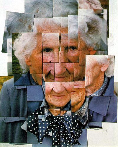
 And here is the final product and the steps I took to create it...


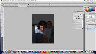
Step 1: Opened image in Photoshop (PS). Before beginning I made sure the layers toolbar and the history toolbar were open/extended.  I then opened the second image that I would crop.


Step 2: Selected the crop tool and chose the 5 inches x 5 inches size (to give a 1:1 ratio). I then draw the area I wanted to crop. Then using 'free transform' I rotated the box, moved it around and adjusted the size until I was happy with the area selected.


Step 3: I pressed enter to see what the crop would look like. I repeated the process of cropping again because I felt that  it wasn't quite right (rotation was a bit off). I went back using the 'history' list on the right side of the screen. I did this until I was happy with the crop. After cropping  used 'free transform' to horizontally flip the image (make it into a mirror image)...You'll see why in a sec.
Step 4: I then dragged and dropped the image on the first image. I wanted this photograph to be the bottom right quarter because I felt it lined up nicely with my hair from the top right quarter so I used a mirror image. Using 'free transform' again, I re-sized it and moved it around until the nose was lined up well. I felt the nose would be a good natural 'centre' for the photograph


Step 5: I repeated steps 2-4 (excluding the mirror image part) for the next photograph. For this photograph I had to ensure the top of the head  and the eyes was also more or less lined up.

Step 6: Surprise, surprise...I did the same with the fourth and final image. I found this one particularly difficult to line up because it was a photograph of me as a baby so my face was comparatively quite small. It meant that I had to keep going back and cropping more and more 'body' in. 


Step 7: Finally, I adjusted the colour colour balance in the top right image and the bottom image. I selected the layer I wanted to adjust, added an 'adjustment layer', selected the 'clipping layer' option to ensure the adjustment layer 'clipped onto' (only affected) the selected layer. For the top right image I reduced the yellow and added a bit of blue and for the bottom left I reduced the green.


I feel I have accomplished what it was I set out to accomplish however a huge criticism I have of my final image is that each skin tone is completely different due to different cameras, the fact it was film and each was developed separately, and the scanning probably didn't help! If I had a broader knowledge of PS I would be able to adjust the skin tones to match and still make it look natural. However when I showed it to others some agreed with my criticism and some said the fact that each image has a different tone makes it more interesting and were surprised when they found out that I didn't do it on purpose so maybe at the end of the day its a personal preference thing...my preference, however, is still matching tones!!!

Wednesday 29 May 2013

Field of View Shoot!

I went out to experiment with field of view and how it affects the image. I found that when you increase the focal length, you lose some of the 'stuff' in the frame however in some cases that works and the final image is better and sometimes it doesn't...Here is some of the shoot with explanations as to which I prefer...

 
                  14mm                                         19mm                                       26mm

                                             36mm                                       42mm

From this set my favourite is the photograph at 26mm because I feel that there is a good sense of depth/distance however the car on the left of the focal lengths 14mm and 19mm is distracting so the 26mm photograph is a good balance...I would however crop it ever so slightly to remove the wheel.

                    14mm                                         18mm                                       25mm

                                           36mm                                       42mm

From this set my favourite is the photograph at 18mm because at 14mm you lose the subject (cone and plastic fence). Again with the other three photographs you lose the background (especially in the 42mm photograph). However the bus in the 18mm really annoys me..i have no idea why it frustrates me so but I think it might be because it is taking away from the subject. 

                                       15mm                                               18mm

                                       25mm                                                36mm

                                                                    42mm

Again, my favourite is the photograph at 25mm because I feel that with the 14mm and 18mm image there is too much pavement and with the latter two the depth perception is lost.

                                       14mm                                                18mm

                                      26mm                                                   36mm

                                                                     42mm

From this set my favourite is the photograph at 18mm because I think the fact that the bike is in the middle of the image and there seems to be a split across the middle of the image between the pavement and the grass and I think it works. The 14mm is too distracting and the other three are 'too green' (too much grass).

Photomontage: Research

Photomontage is a montage technique that involves using photographs to create a montage...not surprising if I'm honest. You can either do it by hand, such as artist Man Ray or nowadays you can use photograph editing software (e.g. Photoshop) and I started researching photomontage. For this unit we investigated many ideas such as composite images and creating images using masks and other photographs (fruitman!)->

My initial idea for the montage stemmed from the photomontage work of David Hockney and the portrait of painter Andy Worhol by fellow painter Jackson Dainty. I was looking through various montage artists but what struck me about Hockney's work was how he would reconstruct faces using only a  couple of very similar polaroids. I love how abstract the final product is and my favourite from his portfolio was this montage he did of his mother (aww!). However I felt that with my minimal knowledge of PS I would struggle to create something this complex. I was looking at different artists and painters who also messed about with the colour and composition; as it happens I am interested in pop art. That's when I came across this painter called Jackson Dainty who did a cool portrait of Worhol that stood out to me and I decided to try to combine the two things...kind of...I decided to do a montage similar to Worhol's portrait below however instead using 4 different photographs of myself from my childhood...I considered experimenting with colour (so it would turn out similar to Dainty's painting) however I decided to keep it simple and I wanted it to look like a photograph at the end of the day instead of a painting... My ultimate aim was to make the montage 'slick' and 'not very obvious'...


David Hockney's Photomontage
+
Jackson Dainty's Painting

I then set off finding the images I was going to use...first I decided that I would use only one digital image and  I would scan in the other three. I chose my digital photograph which is a recent self portrait I took of myself and decided to use this as the 'base' i.e. I would layer the other three on top of this one.


I then needed to select the other three photographs. This meant having to sift through our hundreds of photographs...once I had overcome my dust allergy triggered by the cloud of dust that was released when I opened the photo box. I learnt many things whilst looking through the endless sea of photographs...mainly that my father cannot pull off a moustache and if I really wanted to I could catalogue my mothers life through her various hairstyles but I digress. When selecting the photographs I would use for my montage I was careful to choose photographs where I was more or less facing the camera perfectly because that would help me fit the photographs together later on. Once I had chosen my final few (I chose about 10 to mess around with) I scanned them at home using our 2-in1 scanner and printer (standard Epson printer...nothing special). I ensured that they were  scanned at 300 ppi so that I would be able to manipulate them in PS later. I now had everything prepared for creating my image...

Sunday 12 May 2013

Health and Safety

As part of the Media unit in the Level 3 award we must research, understand and implement the Health and Safety (H&S) regulations as outlined by the government. I researched these five aspects to ensure that the process is as low risk as possible from start to finish...

Working in a Darkroom
When doing research into safety in a darkroom, I found most of it to be common sense and stuff I'd already heard in school in chemistry classes but these are the main points I picked up...

  • Use gloves (to protect skin from chemicals), goggles (to protect eyes from chemicals) and an apron (to protect clothes from chemicals.
  • Use tongs to avoid touching prints with chemicals on.
  • Ventilate the room (windows and fans or air conditioner)
  • No food or water in the darkroom (to avoid accidental ingestion of chemicals)
  • Ensure all chemicals are labelled and efficiently organised.
Control of Substances Hazardous to Health Regulations (COSHH)
Again, a lot of these I recognised from chemistry because it is essential the chemicals are labelled correctly because it gives the user and idea on what the dangers of using them is, how to handle them and what to do if a problem should occur e.g. not keep something flammable near flames and keep a fire extinguisher close by in case it does catch fire.

Here are the symbols...


Provision and Use of Work Equipment Regulations 1998 (PUWER)
These guidelines were put into place to ensure any machinery or equipment used by employees (or in this case students) is safe. This is done by training employees/students to work safely. When on the course before we used any equipment we were shown how to use correctly and were also made aware the risks of the appliance and how to avoid the risk. This was particularly relevant for the studio where we were using a vast amount of electrical appliances and it was crucial for us to know how to safely use the modelling lights power packs. Also, to ensure all electrical appliances were safe, they would all be inspected and a green label placed on so we would know it was safe...


Display Screen Equipment

Finally, I considered the risks associated with using a display screen when using a laptop/computer. I read the "Working with display screen equipment (DSE)" booklet I found on the Health and Safety Executive website. As I went through it I realised I do a lot of the things mentioned already without meaning to such as keeping wrists straight when typing and taking regular breaks and stretch to prevent aches. However there are still some guidelines I should follow such as ensuring I am always sitting up straight when using a display screen. Sometimes the I use a table that is too low and I end up bending my back to type which is REALLY bad for you(...old habits die hard I guess but I will change that now).


Using all of this information about H&S, I have chosen three scenarios where I have used the information for my benefit...

  1. When we did the cyanotypes as part of this media unit, my knowledge of COSSH (and my previous experiences in chemistry in school!) helped my identify the risks of using the Ammonium Ferric Citrate and Potassium Ferricyanide both of which are irritant, Also our tutor advised us on what to do if we got any on our skin (rinse it very quickly and "DO NOT touch your  eyes")
  2. As I mentioned before, our tutors instructed us very thoroughly before we used any equipment in the studio. It was from very basic, common sense instructions such as 'no food or drink' to 'this is how you use a power pack...". This ensured that when we used the studio for our studio unit we knew how to use the equipment and we appreciated how dangerous (and not to mention expensive!) some of the equipment is.
  3. When I did the exterior location brief, I went out to this abandoned derelict cotton mill in Cheadle so i obviously didn't go alone (that would have be too death wish-y)...I dragged my dad along. I also had to make sure i didn't fall over, the ground was very uneven and slippery. Also, to the side of the mill was  stream...with a very steep drop to I had to take care not to plunge to my death!

Saturday 4 May 2013

Photographing Glass!

Similarly to flowers, glass has its own photography style. I found photographing glass almost as challenging as photographing jewellery. Again its all about making it look crisp and aesthetically pleasing. With jewellery you were trying to persuade the viewer to buy this product whereas with glass the aim is just to make it look as beautiful as possible. I found that the key is the reflectors.


Above are some photographs taken by one Simon Bruntnell, a  British photographer who photographs glass amound other things. He is just one of many photographers I looked at on the internet. I found that there weren't many photographers specialising in glass photography like Mr Bruntell here which might be attributed to the fact that it is a very difficult subject to photograph and isn't used very often...or at least not as much as some other specialties (e.g. commercial). What I really love about his work is the fact that most of it has a sinister feel to it. The background is often dark and he adds a lot of detail using reflectors which really makes the glass 'POP'. He also uses mirrors and reflections in a lot of his work which gives it a bit of an abstract edge.

After my research we set out to photograph glass which was at that point the hardest thing I had attempted at that point. We used wine glasses and beer bottles...they were of course already empty when we began :) However disaster struck a few weeks later where my memory card decided that it no longer like any of my photographs and destroyed them all! So I won't be able to show you the images however I do have the ones I did when I went back and did a few more on my own in the studio...here is the lighting plan I used...


After I had set up the lighting and adjusted the aperture for a correct exposure I had to choose a compostion for the subject I had chosen. At first I decided to work with this composition ...


 ...however I decided that it wasn't working because the shape of the glasses was too difficult to make out (due to the overlap).So then I went with this set up...


Once I had selected my compostion, I started to play around with reflectors to add detail. In the image above there is not much detail compared to the one directly below. However in this particular image I felt that there was too much detail (which is why I'm posting it!). In this particular instance less is more.


I continued to play with reflectors until I was satisfied with the level of detail. And here is the final piece....drum roll please...


I do quite like it however I was slightly limited for time when I took these so if I had more time I would have liked to experiment with some more compositions. I also would have liked a different background chair-looking thing (apparently it's called a 'small product table') because the one I used as a little scratched and I tried using my (very limited) photoshop skills to edit it however I wasn't really able to do much (again I refer you to my limited PS skills!).

Being Abstract!

Creating abstract and interesting photographs isn't easy howver one technique I thuroughly enjoy using is the use of a wide angle lens (WAL). Using a WAL distrorts our depth of perception and messes with the perspective of the photograph therefore provides a more interesting and thought-provoking composition. The entire 'mood' of the image changes just because of the use of a WAL and a change in viewpoint. Here are some of the photographs from this shoot...what I did was do a before and after thing so i can compare the two...

                                            BEFORE                                       AFTER


What I love about this set is the fact in the first one you can tell its a cone whereas in the second because of a combination of the unusual birds-eye view and the WAL it appears to be a cylinder! MIND=BLOWN!!!


As you can see here the composition seems to be pretty standard and lets face it...BORING! However with a little outside-of-the-box thinking you can make the line converge which produced a more intresting image.


 This set is a perfect example of how in using the same composition and making it abstract can completely change the image...I dislike the first one... I feel there is no life in it..u'know its just a lampost with a wall and trees in the background...whereas the second has a more intuging and I feel it has personality...also I like the fact there is nothing buy sky in the background (the background in the first one was just distracting)


I really dislike the first image, it's so clumsy and pointless! However I really like the second image because of    angle of view the WAL provides. It gives the photograph 'layers' and the shallow depth of field just tops it off for me really.


This works well I think becasue in the second image you cannot really tell what the word is you can only really make out the first 4 letters so I feel it gets you thinking and if you are as stubburn as me you will not take your eye off of the photograph until you figure it it just says 'Reception>' XD !!!!