Hi and welcome to my post on experiments for the experimental unit where I will elaborate on what I said in my sketchbook. I will discuss my processes, my images and evaluate the entire experiment based on the final images produced and whether I think they are what I set out to produce!
NB: All images taken on my Panasonic Lumix DMC-G3 with my 14-42mm 3.5-22 lens (unless otherwise stated)
1. Pouring Liquids!
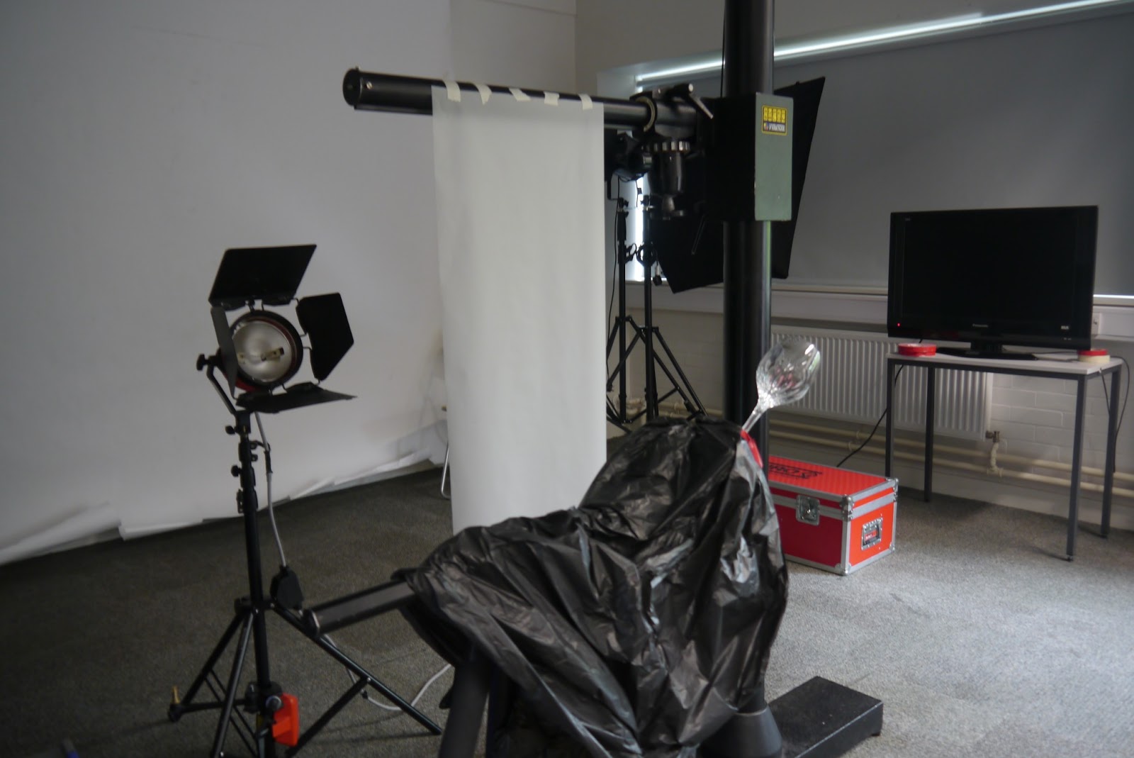
This we did as a class and one of the few experiments I did with other people (now I sound like a recluse!). It was fun to have my photography peeps around and frankly I would have needed the help...it was three person experiment (one to pour, one to stabilise the tripod and one to shoot!). Below I have a couple of photographs which shows the set up...


The tracing paper was attached to the (comicly large) clamp and there were large clips attached to the bottom to ensure the paper was flat. The tripod held the glass, it was at an angle to give a 'sloshy' effect when the liquid was poured. As I mentioned, the tracing paper was placed to diffuse the light from the red head because that was one bright light...lets just say I'm lucky my corneas are still intact!
When I got first saw my images they looked like this...


I chose it mainly because I felt that it was the most impressive and I am IN LOVE with those little droplets! Also there is a good amount of liquid within the glass giving the perfect amount of 'sloshiness' I mentioned earlier.
2. Bubbles Galore!
I had a lot of fun with this one...as did my assistant (i.e. my mother!) She blew the bubbles and I took the photograph. This was tricky because it was a particularly windy day however if I had waited for a windless day in Britain...I would die of old age before I could do the experiment! But I digress. A lot of the images looked like this...

...But we persevered. In the end I got a few decent images...my personal favourite being this one because I feel like it satisfies the image I had in my head the most.

Of course I'm not the only one with a worrying obsession with bubbles...oh no siree. In fact photographer Richard Heeks beat me to it! I came across him when I was searching for bubbles photographs on the Internet...here's a link to a Daily Mail article about him (images are on the article)...http://www.dailymail.co.uk/news/article-2311000/Photographer-Richard-Heeks-captures-incredible-images-world-reflected-bubble.html
I knew I could never achieve anything with the detail and precision he has (the second photograph blew my mind!) but I am still happy with my images. When comparing our images i noticed a difference in style...mine were very full on and I tried to include as many bubbles as humanly possible whereas with his work he really focused in on just one or two of the bubble. His were calm and mine were chaotic! Also he tended to use the reflections he got from the bubbles whereas I took them as a whole. So it was interesting to see how with something as narrow as photographing with bubbles there can be such variation.
3. Cyanotypes!
PLEASE SEE CYANOTYPES POST FOR THE PROCESS AND EVALUATION OF IMAGES!
http://amenasphotographyjourney.blogspot.co.uk/2013/06/cyanotypes.html
I was interested to see how cyanotypes were used especially seeing as it is a historical process. That's when I came across the work of Anna Atkins, a British women who combined photography and biology (a woman after my own heart!). Between the years 1843 and 1850 she made cyanotypes photograms and catalogued over 200 species of British algae. It was the first body of photographic work published by a woman and also the first ever book published made entirely of photographic images. Here are a couple of my favs of hers...


6. Shadow Effect!
Again this wasn't one of my most exciting experiments but the images I got were half decent...my grandmother really seemed to enjoy them :) I got the idea from my desire to photograph things without actually photographing them...if that makes sense...So I would photograph the shadow instead of the thing itself. When looking for shadows to photograph I looked for odd and peculiar shapes, patterns and small detail...


Even though I loved the abstract shadows I preferred the images with the subject in the frame. I chose this as my final image because the flowers in the foreground the flower added depth to the image. It was out of focus thus highlighting the fact that the shadow is the subject. If I were to do this experiment again I would try it at a different time of day (e.g. morning instead of afternoon) and see what effect this has on the shadows.
7.Minnie Montage!
The title says it all. I did a montage using an image of my little sis Minnie. More specifically I did a composite image on PS...I warn you now my PS skills are VERY limited.
Here are screen shots from the process...
 ORIGINAL!
 Step 1: Saturate (so you can see the image behind layers).


Step 4: Added the fur texture and used a gradient mask again (only it was a different one this time it was a more feathered one) and changed opacity of the layer as well.
 Step 5: Added the grass texture however I liked it the way it was with only the opacity reduced no mask needed.

NB: All images taken on my Panasonic Lumix DMC-G3 with my 14-42mm 3.5-22 lens (unless otherwise stated)
1. Pouring Liquids!
This we did as a class and one of the few experiments I did with other people (now I sound like a recluse!). It was fun to have my photography peeps around and frankly I would have needed the help...it was three person experiment (one to pour, one to stabilise the tripod and one to shoot!). Below I have a couple of photographs which shows the set up...

When I got first saw my images they looked like this...
I then took it upon myself to edit them in PS by cropping (because the right side was hideous) ensuring the light remains in the middle and also adding a cooling filter because I felt that the warmth of the light drowned out image (looks sleeker when cooler).This was my final image...

SS: 4000 Aperture: 5.6 ISO: 160
2. Bubbles Galore!
I had a lot of fun with this one...as did my assistant (i.e. my mother!) She blew the bubbles and I took the photograph. This was tricky because it was a particularly windy day however if I had waited for a windless day in Britain...I would die of old age before I could do the experiment! But I digress. A lot of the images looked like this...
NO BUBBLES :(
I knew I could never achieve anything with the detail and precision he has (the second photograph blew my mind!) but I am still happy with my images. When comparing our images i noticed a difference in style...mine were very full on and I tried to include as many bubbles as humanly possible whereas with his work he really focused in on just one or two of the bubble. His were calm and mine were chaotic! Also he tended to use the reflections he got from the bubbles whereas I took them as a whole. So it was interesting to see how with something as narrow as photographing with bubbles there can be such variation.
3. Cyanotypes!
PLEASE SEE CYANOTYPES POST FOR THE PROCESS AND EVALUATION OF IMAGES!
http://amenasphotographyjourney.blogspot.co.uk/2013/06/cyanotypes.html
I was interested to see how cyanotypes were used especially seeing as it is a historical process. That's when I came across the work of Anna Atkins, a British women who combined photography and biology (a woman after my own heart!). Between the years 1843 and 1850 she made cyanotypes photograms and catalogued over 200 species of British algae. It was the first body of photographic work published by a woman and also the first ever book published made entirely of photographic images. Here are a couple of my favs of hers...
What I absolutely love other than the contrast between the subject and background is the fact that there is also writing on the cyanotype which if I get the chance to do cyanotypes again I would not only use a different negative, I would write on the acetate to produce writing... heck the whole thing could be writing!
4. WB vs. Noise!
As I mentioned in the book I felt that this experiment was the worst of the lot because the results weren't very powerful, yes some of them were extreme e.g. the WB images however I thought they were HORRIBLE. I did not like them at all so when I came to select my final image I selected this one because I felt it was the lesser of many evils! I liked how the change in WB changed the tones of the image and yet that yellow bush behind just dominated the blue...plus I think the froggies are cute!

What I will say about this experiment is that I was pleasantly surprised when I got my prints back because you could see the difference the noise makes especially in the owl image. On my laptop screen there was virtually no difference between the images at 160 and 6400 for ISO however the grainy effect was obvious when you come to see them in print! I have no clue as to why this was but I suspect it had something to do with the fact that my monitor was too bright.
5. Q.S.W.P. !
Now this one was a lot of fun too! I felt like I'd stepped into a Lewis Carroll novel as I was peering through the now colourful viewfinder! It was very fiddly, the rubber bands kept pinging off but its all in the name of art so its all good fun! I took a snap with my phone to demonstrate how I attached the wrappers..it's all very Blue Peter...

One thing I was very surprised with was that the image wasn't 'wrinkly' like the wrapper which is what I was expecting. In a way I was a bit disappointed but I am still very happy with the results. If I were to do this experiment again, I would perhaps try to layer them on top of each other and see what colours I end up with! Also I don't have to limit myself to QSWP, in theory I could attach anything really(oooh JUST got an idea...tissue paper!)
Oh here's my final image. I chose it because it was the one that evoked the most emotion within me...its all very horror movie-esqe! The red is so bloody in this one I couldn't NOT pick it!

6. Shadow Effect!
Again this wasn't one of my most exciting experiments but the images I got were half decent...my grandmother really seemed to enjoy them :) I got the idea from my desire to photograph things without actually photographing them...if that makes sense...So I would photograph the shadow instead of the thing itself. When looking for shadows to photograph I looked for odd and peculiar shapes, patterns and small detail...


I particularly like these two because they demonstrate the two types of images I ended up with obvious (left) where it is clear what the shadow is of so the subject is in the frame and abstract(right) where you are unsure of the subject and all you see is shadows and shapes.

Even though I loved the abstract shadows I preferred the images with the subject in the frame. I chose this as my final image because the flowers in the foreground the flower added depth to the image. It was out of focus thus highlighting the fact that the shadow is the subject. If I were to do this experiment again I would try it at a different time of day (e.g. morning instead of afternoon) and see what effect this has on the shadows.
7.Minnie Montage!
The title says it all. I did a montage using an image of my little sis Minnie. More specifically I did a composite image on PS...I warn you now my PS skills are VERY limited.
Here are screen shots from the process...
 ORIGINAL!
 Step 1: Saturate (so you can see the image behind layers).
Step 2: Added the wood texture and used a feathered mask and changed opacity of the layer.

Step 3: Added the detailed floor texture and used a gradient mask and changed opacity of the layer as well.

 Step 5: Added the grass texture however I liked it the way it was with only the opacity reduced no mask needed.
Step 6: Finally, added the leather texture put a 'hard' mask on so it only appears in the bottom corner I didn't change the opacity of the layer...JUST JOKING of course I reduced the opacity I'm not mad!!!
Here is the final image...

This was my least favourite experiment because it basically meant that I spent more time at the computer than out with a camera which I don't particularly like! I was very bored when doing it, I've always felt that way about PS but I was determined to see it through!
8. Mirror Images!
 This was one of my favourite experiments mainly because I was playing with the reflections and shadows of objects idea again. Went down to the botanical gardens in Duthie Park in Aberdeen and spent a couple of hours photographing the flowers in my heart-shaped pocket mirror...It was a of fun because not only was it physically challenging squatting in awkward positions to photograph the flowers but also to get the angle perfect on the mirror-NIGHTMARE! I would have to take about 10 photographs before I find the right angle but looking at the images it was DEFINITELY worth it ! Here are a couple of my favourites...


It was a toss up between that last one and the one I chose for my final what I love about the one above is that the red contrasts well with the green however I went with the one I went with for two reasons... 1) you could see the flower in the foreground and my reasoning is similar to the shadow final in that the flower gives it depth and 2) I think its a really lovely colour! Without further ado I present my final image...


I thoroughly enjoyed defacing my sisters {insert evil cackle} and I would love to do it again {insert even more maniacal laugh} but if I were to do it again I would use perhaps 9x6 inch prints or perhaps even 12x8 inches in order to do detail better. Also I would perhaps stick some stuff on with glue...I could go crazy with glitter, pom poms, googly eyes...u know...the usual! I also thought of doing speech bubbles and perhaps all of these ideas with a group shot (more than one person in the image)

This was my least favourite experiment because it basically meant that I spent more time at the computer than out with a camera which I don't particularly like! I was very bored when doing it, I've always felt that way about PS but I was determined to see it through!
8. Mirror Images!
 This was one of my favourite experiments mainly because I was playing with the reflections and shadows of objects idea again. Went down to the botanical gardens in Duthie Park in Aberdeen and spent a couple of hours photographing the flowers in my heart-shaped pocket mirror...It was a of fun because not only was it physically challenging squatting in awkward positions to photograph the flowers but also to get the angle perfect on the mirror-NIGHTMARE! I would have to take about 10 photographs before I find the right angle but looking at the images it was DEFINITELY worth it ! Here are a couple of my favourites...
It was a toss up between that last one and the one I chose for my final what I love about the one above is that the red contrasts well with the green however I went with the one I went with for two reasons... 1) you could see the flower in the foreground and my reasoning is similar to the shadow final in that the flower gives it depth and 2) I think its a really lovely colour! Without further ado I present my final image...

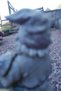
9. To Focus or Not to Focus?
You've probably guessed the experiment...that's right... I messed around with focus...and strangely concentrated on photographing my great aunts garden gnomes. I wanted the majority of the image to be out of focus which I achieved with a couple of images and I'm going to take you through my reasoning when choosing my final image...
I like the composition of the one on the bottom more than the one on the top because the one on the top is slightly boring because there's no colour or life in it whereas with the one on the right the flowers make it more interesting plus the cheekiness of the hiding gnome gives the image character. I then had to choose between that one and the one directly below and I chose the one below because you can see more of the gnome...in the other one half his hat and face is cut off :(

I feel this experiment was successful because I am very happy with my final image and I have achieved my goal of producing an image where most of it is out of focus...in fact the entire image is out of focus!
10. Silly Faces!
My final experiment was definitely my messiest! My idea stemmed from Gerhard Ritcher's Painting/Photographs. He would basically take photographs, develop and process them and then paint on them. I love how abstract his artwork is, especially when it comes to distorting portraits of people...


I didn't try to copy him however because anytime I try anything abstract with paint it turns out looking like someone let loose a 2 year old in a pot of dulux...which now I read that back would be lovely and artistic but the point I'm trying to make is in another life paint and I were enemies...So I used permanent markers and tip-ex instead and drew my little sisters and cousins as cartoony characters. I also had an idea to use face paints...that's as far as I go. Because I had printed the images 6x4 inches I couldn't really use the sponge so I used the brush and cotton buds instead...Here is my final image...
No comments:
Post a Comment